
Tips To Pick The Perfect Artwork For Your Interiors
Don’t make the mistake of treating interior design art as an ‘afterthought’ within your design process. Artwork plays a key role and should be considered during creative conceptualization stage.
Not only does artwork provide an instant color palette, but it can also add a perception of texture, create a strong visual impact and bring a sense of completion to a design.
So how do you pick the perfect interior design art and use it to elevate your interiors to new heights?
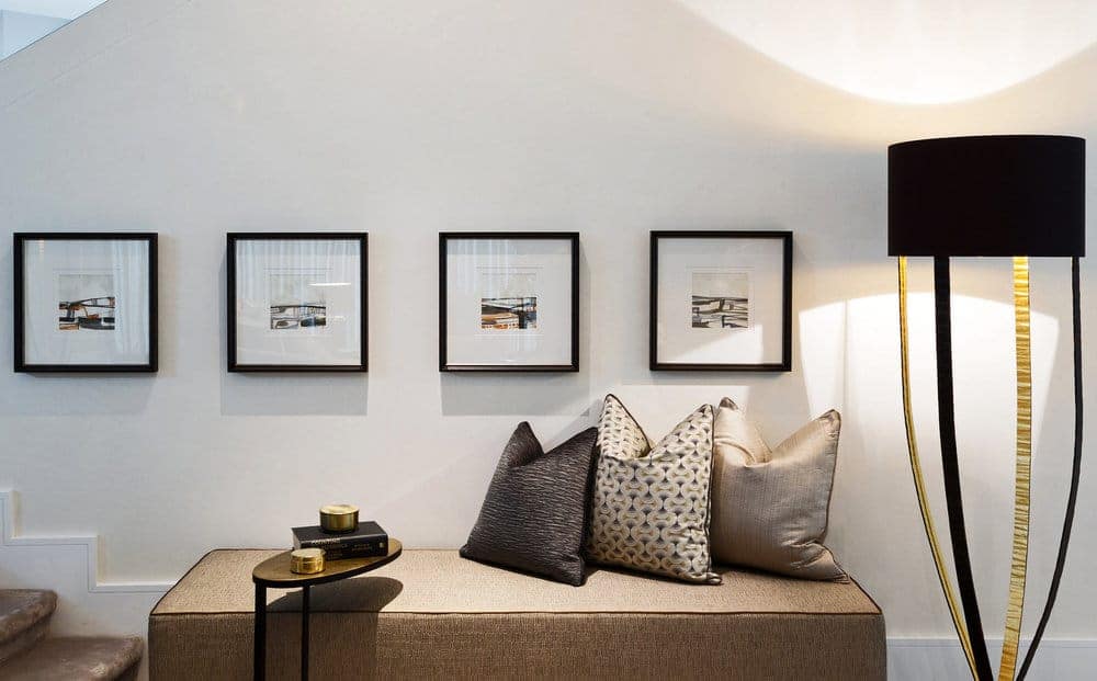
1. MAGNIFICENT MULTIPLE PRINT DISPLAYS
A gallery of multiple prints adds contemporary, stylish flair to your interiors and acts as a key feature within the design.
Tip: Select artwork that follows the same style (ideally by the same artist) and displays multiple prints in a linear arrangement.
we can echo the dark and golden color tones of the surrounding furnishings in the gallery of prints above, adding powerful depth and gracefulness to the design.
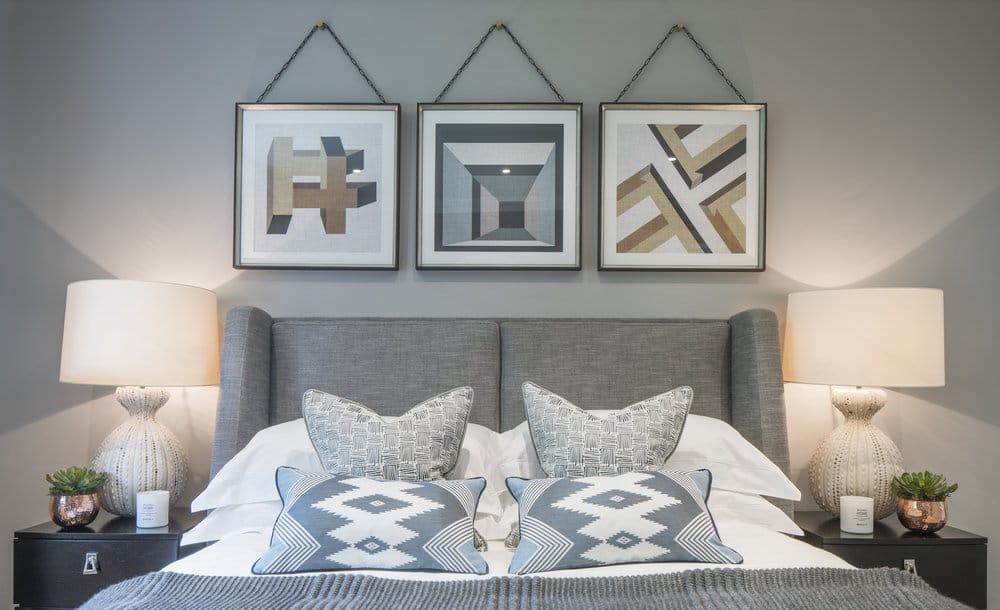
2. COLOUR REPETITION WITH CLARITY
A continuation of color creates a strong impact within a room and adds depth to your design.
Tip: Repeat the same colour tones (they do not need to be exact, but similar) in both the artwork and the surrounding interiors. The more colours you repeat, the more robust the look will be.
we can pair the prints on either side of the bed to add a burst of blue colour, whilst also reinforcing the copper accents in the soft furnishings.

In the image below artwork brings out the blue and grey tones in the soft furnishings in this bedroom design, whilst the abstract pattern in the cushions reinforces the impact of the artwork.
3. DYNAMIC COLOUR CONTRASTS
Establishing a colour contrast between artwork and surrounding interiors is a great way to add a pop of colour to your design.
Tip: You can either choose to contrast light and dark colours (including tones of the same colour) or you can contrast hues of colour (green/red, black/white, for example). The more extreme the proportions of contrasting colour (a space decorated predominantly in one selected shade and accented with just a touch of another colour), the more dominant they will be.
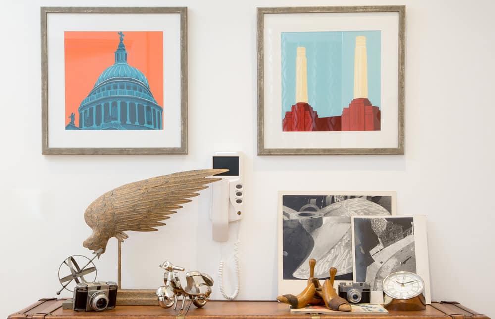
Similarly, the quadrant of prints can add strong blue tones to a neutral, minimalist design.

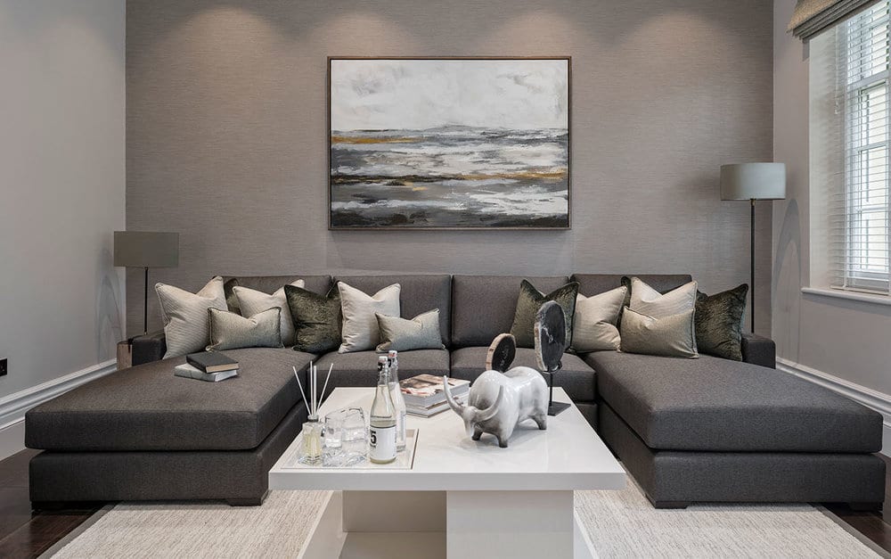
4. CAREFULLY CONSIDERED FURNITURE PLACEMENT
The placement of furniture surrounding a piece of art is as important as the placement of the art.
Tip: Place your interior design art above a side table, bench, bed or sofa to maximise its emphasis within the design. Don’t hang it too high, the center of the image should always be eye-level.

5. PROMINENT STATEMENT PIECES
A key principle in interior design is that every room requires a focal point, a single element of design that instantly draws your eyes towards a point in the room. The artwork is a superb way of creating this essential focal point within your design.
Tip: Consider the size of your room and scale the size of your interior design art accordingly. Remember, the artwork must be large enough to make a statement within the room, if it is too small then it will be drowned out.
6. CALMING COLOUR BALANCE
Balancing colours will instill a sense of harmony within your design and establish a calm ambiance in the room.
Tip: Continue the colour tones of your interior design art into the surrounding furnishings in equal proportion.

If we can assist you with more with your interior design art, please feel free to get in touch.
-Yashashree Somavanshi
1 comments